
Upgrade to enjoy this feature!
Vital MX fantasy is free to play, but Premium users receive great benefits. Premium benefits include:
- View and download rider stats
- Pick trends
- Create a private league
- And more!
Only $10 for all 2026 SX, MX, and SMX series.
like Bermuda pants and rolled jorts....very euro...
Im sure I’ve seen uglier bikes, just can’t think of them right now
While it is not the most stylish look, I appreciate them doing some different. It's nice to have variety.
And for a sponsor, the bold display of the logo is actually helpful, as its really hard (except RedBull) to tell what brand is on the shrouds, because how small they usually are.
Maybe not decals related, but does anyone know why they use 2 different suspension brands? Herlings and Fernandez are on KYB in any picture and movie I saw the last weeks, but Vialle and Lata on Showa.
The Shop
Free shipping: VITALMX
DeCal Works Huge Plastic Inventory of UFO and Polisport kits.
Luxon 4-Post Bar Mounts
$189.95 - $239.95
Reminds me of the early 2000's, when side plates had no numbers and the designs had outrageous color schemes.
Guess Darkside and the Berm Lords landed a big graphics job? Could use a few more on the front fender.
Because racing is expensive and someone has to pay for it.
I like it, it’s something different
Did Nascar buy Honda HRC in MXGP? TF is all that billboard garbage..
Good question I noticed that in the 4 rider shoot
Who in the hell approved that look, gotta be the ugliest factory bike out there.
If it had regular sized numbers on the side plates I could probably be ok with it. This is just ugly. Why even have the numbers on the side?
Most likely rider preference . Thats been a common reason in the past that Teams have done that. as far as suspension brands.
I do like that they went away from a stock looking bike for the first time in awhile. I've had customers want graphics that look like the Factory Honda's. But with all of their personal logos. And removing the CRF logo from the shrouds...... Well the bike was just solid red at that point.
I do like how simple the Honda's have looked. Its easy to just throw a bunch of shapes at a graphic and come up with something that people will like. But it's much more challenging to make a cool looking design with minimal elements. and not look too plain. I prefer the more simple style myself. These Honda's will grow on people.
These bikes will likely end up getting more attention based of the looks than they would have if they stuck with the same old look they have had for almost 10 years now. So they are getting more exposure for their sponsors before the racing even starts. Anytime You make a drastic change there will be people who dislike it at first and then come around.
The issue is just the angle of the Honda logo. If someone can edit it to align with the top of the seat it would look much better.
Cool small numbers, Honda.
Interesting that all the 450's have solid clamps and the 250 has split style clamps. And WOW those start devices are so low. I wonder if Acerbis will offer Blue CRF plastic. The bikes do have the most Freestyle look of any Factory MX Honda I can think of. I like the looks of the rally bikes so maybe they are trying to have more of a unified look ? I like bigger side plate numbers . But other than that I think they look decent.
They all have a similar look other than the US team. With the Giant HINDA logo at the angle. The blue, etc.


I don't mind being in the minority. I like it.
Appreciate it's a new shape, but all they needed to do was swap the "Progressive logo" with Petronos and chuck a claw around the air box. Whoever looked at the Dakar bike and decided it'd look good on a Motocross bike needs glasses.
Pit Row
It's so bad,so actually so good,cool and unic.
1. It reminds me gp bikes from 00s,can we call it retro look?
2. All those sponsors have own colors and needs space on the mx bike,which isnt so big,so it's hard to find compromise.
It’s not a design.
It’s like illustrator threw up on some vinyl .
Certainly seen better graphics but great to see monster and petronas on board
I made a quick and sloppy enlargement to the side numbers and added a little red on the rear fender .
The new graphics track the MotoGP graphics, so I think we can assume Honda is good with them.
I think a reduction of about 20% on the HONDA font to make room for the side plate decals would be a good start. Fix the color fiasco and miniature numbers on the side plates. Then put a fucking red fender on it, like it’s supposed to have and it might not be too bad.
Maybe they just really liked how the Beta's look with that dark blue on them. If not for the giant HONDA logos You could confuse them for a Beta while out on the track in reduced visibility. Like when Supercross splits up into the 30 box view .
I for one LOVE the design. Yes must be the minority. But after years of just red it's just time for a change. Good on them for getting PETRONAS and monster energy on board. With sponsors pulling out of motorsport kudos to hrc for bringing some heavy hitters into their lineup. Hopefully these bikes go well ! Rooting for Herlings this year.
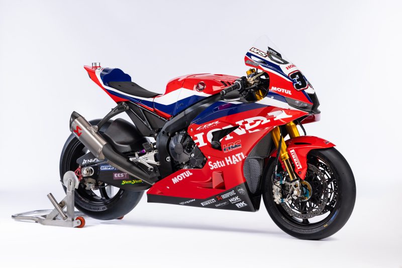
Sidenote doesn't the hrc cbr1000rr superbike look sexy af ?
Probably true. Then they should reduce the size of their g....d..... name.
It’s unique for sure! I made some small changes too…
Truly heinous.
From Mantova last weekend:
Post a reply to: HONDA MXGP