

Posts
3434
Joined
6/24/2014
Location
Charlotte, NC
US

Edited Date/Time
8/7/2014 2:02pm
Wow... Not even sure what to think here lol... The bachelors degree in business part of me sees the strategic marketing approach for both Blue Buffalo and Slater Skins (if you hadn't heard of these companies before, you have now; mission accomplished there). The moto obsessed fanboy side of me raises an eye brow, but wonders if this kind of thing could be a positive thing for our sport (attracts more sponsors, money etc). ...but the aesthetics obsessed part of me is screaming Whiskey Tango,Foxtrot ,over?!?
Good luck to him this weekend!! Carolina riders representing strong these days..
http://racerxonline.com/2014/08/06/title-zimmer-to-debut-with-the-blue-…
Good luck to him this weekend!! Carolina riders representing strong these days..
http://racerxonline.com/2014/08/06/title-zimmer-to-debut-with-the-blue-…
that thing is hideous
The Shop
Ive been through upstate New York on a baffaloe thats blue
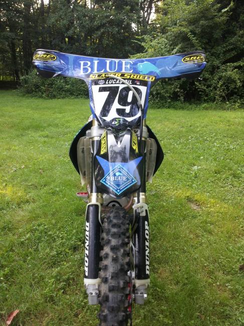
The front of the bike looks like a speedway bike. I think it looks okay on speedway bikes but it is Fugly as hell on a MX bike!
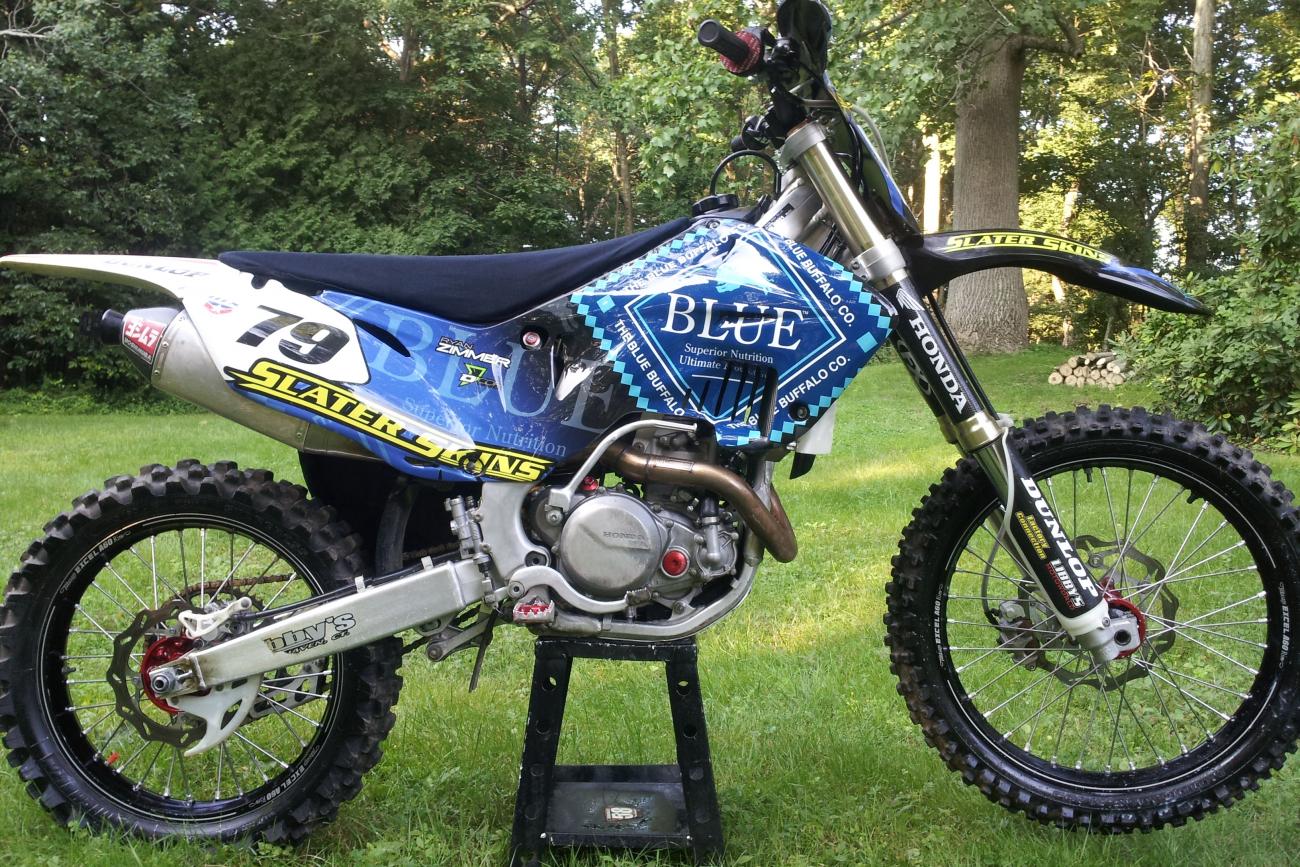
The plastics on a bike more or less serve a purpose as far as bike functionality, and nothing more. Fenders keep the mud away from the rider, shrouds channel air into the radiators and protect some of the electrical parts, number plates hold the numbers. All of these things have, over time, gotten more and more refined to be as small/slim/efficient as possible, while still keeping a cool look.
However, what Blue Buffalo has done is said fuck all that noise, im going to slap a car bumpers worth of plastic on the side of a bike and cover it in funky looking graphics.
Bikes are like formula 1 cars in a way- nothing on them is there that doesnt help it achieve its goal, which is going as fast around the track as possible. This bike is like if Ferrari all the sudden started putting those cheap chrome grills and fake hood scoops on their cars.
Colors are lifeless and clash from one end of the bike to the other.
Graphics look like a cat head on the front fender with a Blue Buff logo laid over it.
SRP and Slater logos haphazardly placed.
Honda decals on the forks with the wing going up and backwards. Backwards Honda wings really drive my ass batty. Maybe I'm OCD, I don't care.
Black front fender and rimmage looks like ass.
And I know absolutely nothing about graphics design but I do know the overwhelming majority of people think that Slater Skins look horrific. Slater needs to hire someone to make their product look appealing, it can be done.
Pit Row
Please make it stop!
With the skins it looks like shit x2
1) Who is the most talked about privateer heading into Unadilla?
2) Had you heard of Blue Buffalo before this week?
As Jeff Zimmer so eloquently put it IT'S MARKETING.
now for the rest of those who don't ride or those that ride real slow (like me) looks are the most important aspect of the bike....cause all we do is look at it....
good luck Ryan!
One thing is true though, its getting more talk than any other bike coming in this weekend. Mission accomplished.
2) Anyone with a pet or a television has heard of them.
Marketing? If you have to give it away to get someone to use it then what's the point?
2) I don't have a TV so point well taken.
Regarding If you have to give it away to get someone to use it then what's the point? my response is what's the point of responding to your question when it is based on a false assumption IE give it away to get someone to use it? I am not at liberty to get into the business arrangements but this is a great deal for the Zimmers Blue Buffalo and Slater Skins. It is a win win win for all concerned and everyone is getting their money's worth.
VitalMX is representative the world with the glass half empty people and the glass half full folks. You half empty people keep thinking negatively while the rest of us focus on the positive instead of the SSDD mentality the runs rampant in this sport.
Post a reply to: Zimmer's Blue Buffalo bike for Dilla